The world of neogeography is a new one. With advances in modern technology, the ability to make maps has rapidly developed and in the modern age, has become so easy and so available that anyone can make a beneficial and informative map.
With neogeography though, there are many positives and negatives. In terms of positives, neogeography allows people to make whatever type of map they want. This allows for a plethora of different maps to be created. The creativity given in neogeography to create a map of "whatever you want" allows for maps to be made for nearly anything. From standard maps of boundary lines to more modern maps of walking tours, the possibilities for a neogeographical map are endless. Furthermore, with modern technology, the ability to imbed information in a map makes them much more useful. To only have a piece of paper as a map isn't as helpful as an interactive map with audio/visual aids, like the one above, and many other new wave maps. Furthermore, putting the power of map making in the hands of the others allows for new and creative maps to be made of areas where little is known.
With these positives does come negatives however. The biggest downfall to neogeography in my opinion is that the maps suffer from becoming too simplified. Since everyone can make these maps, and since everyone isn't a full scale cartographer, these maps may not be perfect. Information such as elevation, scale and other important aspects of a map may be left out on some of these new maps. Also, depending on the focus of the map, other important details may be left out, which allows for these maps to be incomplete and less of a resource.
My personal map is a sightseeing tour of Los Angeles that pinpoints the locations of the best tourist attractions in LA. Below is a link to my map:
http://maps.google.com/maps/ms?hl=en&ie=UTF8&msa=0&msid=200438625142593673299.0004a0e63922270ef4aed&ll=34.18795,-118.360519&spn=0.312963,0.54451&z=11
Thursday, April 21, 2011

Thursday, April 14, 2011
Lab 2: USGS Topographic Maps
1. What is the name of the quadrangle?
The Beverly Hills Quadrangle.
2. What are the names of the adjacent quadrangles?
Canoga Park, Van Nuys, Burbank, Topanga, Hollywood, Venice, Inglewood.
3. When was the quadrangle first created?
The topography was compiled in 1966.
4. What datum was used to create your map?
North American Datum of 27 (NAD 27) and the North American Datum of 83 (NAD 83).
5. What is the scale of the map?
1:24,000.
6. At the above scale, answer the following:
a) 5 centimeters on the map is equivalent to how many meters on the ground?
1,200 meters.
b) 5 inches on the map is equivalent to how many miles on the ground?
1.894 miles.
c) one mile on the ground is equivalent to how many inches on the map?
2.64 inches.
d) three kilometers on the ground is equivalent to how many centimeters on the map?
12.5 centimeters.
7. What is the contour interval on your map?
The contour interval is 20 feet.
8. What are the approximate geographic coordinates in both degrees/minutes/seconds and decimal degrees of:
a) the Public Affairs Building;
34.073934 N,-118.439098 W
34°4'26" N, -118°26'20"W
b) the tip of Santa Monica pier;
34.007546 N,-118.499915 W
34°0'27" N, -118°29'59" W
c) the Upper Franklin Canyon Reservoir;
34.120155 N,-118.410283 W
34°7'12" N, -118°24'37" W
9. What is the approximate elevation in both feet and meters of:
a) Greystone Mansion (in Greystone Park);
560 feet/170.69 meters
b) Woodlawn Cemetery;
140 feet/42.67 meters
c) Crestwood Hills Park;
700 feet/213.36 meters
10. What is the UTM zone of the map?
Zone 11.
11. What are the UTM coordinates for the lower left corner of your map?
3,763,000 Northings and 362,000 Eastings
12. How many square meters are contained within each cell (square) of the UTM gridlines?
1,000,000 square meters
13. Obtain elevation measurements, from west to east along the UTM northing 3771000, where the eastings of the UTM grid intersect the northing. Create an elevation profile using these measurements in Excel (hint: create a line chart). Figure out how to label the elevation values to the two measurements on campus. Insert your elevation profile as a graphic in your blog.

14. What is the magnetic declination of the map?
14 degrees.
15. In which direction does water flow in the intermittent stream between the 405 freeway and Stone Canyon Reservoir?
Water flows south in this intermittent stream between the 405 freeway and the Stone Canyon Reservoir.
16. Crop out (i.e., cut and paste) UCLA from the map and include it as a graphic on your blog.

The Beverly Hills Quadrangle.
2. What are the names of the adjacent quadrangles?
Canoga Park, Van Nuys, Burbank, Topanga, Hollywood, Venice, Inglewood.
3. When was the quadrangle first created?
The topography was compiled in 1966.
4. What datum was used to create your map?
North American Datum of 27 (NAD 27) and the North American Datum of 83 (NAD 83).
5. What is the scale of the map?
1:24,000.
6. At the above scale, answer the following:
a) 5 centimeters on the map is equivalent to how many meters on the ground?
1,200 meters.
b) 5 inches on the map is equivalent to how many miles on the ground?
1.894 miles.
c) one mile on the ground is equivalent to how many inches on the map?
2.64 inches.
d) three kilometers on the ground is equivalent to how many centimeters on the map?
12.5 centimeters.
7. What is the contour interval on your map?
The contour interval is 20 feet.
8. What are the approximate geographic coordinates in both degrees/minutes/seconds and decimal degrees of:
a) the Public Affairs Building;
34.073934 N,-118.439098 W
34°4'26" N, -118°26'20"W
b) the tip of Santa Monica pier;
34.007546 N,-118.499915 W
34°0'27" N, -118°29'59" W
c) the Upper Franklin Canyon Reservoir;
34.120155 N,-118.410283 W
34°7'12" N, -118°24'37" W
9. What is the approximate elevation in both feet and meters of:
a) Greystone Mansion (in Greystone Park);
560 feet/170.69 meters
b) Woodlawn Cemetery;
140 feet/42.67 meters
c) Crestwood Hills Park;
700 feet/213.36 meters
10. What is the UTM zone of the map?
Zone 11.
11. What are the UTM coordinates for the lower left corner of your map?
3,763,000 Northings and 362,000 Eastings
12. How many square meters are contained within each cell (square) of the UTM gridlines?
1,000,000 square meters
13. Obtain elevation measurements, from west to east along the UTM northing 3771000, where the eastings of the UTM grid intersect the northing. Create an elevation profile using these measurements in Excel (hint: create a line chart). Figure out how to label the elevation values to the two measurements on campus. Insert your elevation profile as a graphic in your blog.

Intersection Points of Northings and Eastings
(Points 5 and 6 occur on the UCLA campus)
*** Y-Axis represents Elevation in Feet***
14. What is the magnetic declination of the map?
14 degrees.
15. In which direction does water flow in the intermittent stream between the 405 freeway and Stone Canyon Reservoir?
Water flows south in this intermittent stream between the 405 freeway and the Stone Canyon Reservoir.
16. Crop out (i.e., cut and paste) UCLA from the map and include it as a graphic on your blog.

Thursday, March 31, 2011
Lab 1
MAP 1: Racial Distribution in Chicago
This map depicts the racial distribution in Chicago, IL as of 2009. It was created by Bill Rankin in 2009 and was published in the Spring 2010 issue of the Yale School of Architecture journal, Prespecta. Each different colored dot represents a different ethnicity, and represents 25 people.

This map is interesting because it gives a very clear image of how racially separated neighborhoods are in Chicago. There are distinct geographic areas in Chicago that are almost exclusively dominated by one race, most noticeably the south side being dominated by African Americans. This trend of racially dominated neighborhoods is replicated in many cities across the United States, and was very pronounced in Chicago during the early 20th century. Even today, these trends still exist as evidenced by the above map.
Website: http://www.urbagram.net/v1/revision/Shapefile?rev=0
MAP 2: World Population Distribution

This map was created at the University of Sheffield in 2009 and was published in The Telegraph in Europe. Instead of traditional map of the world, this map is based on population distribution. The size of countries on this map is determined by their population statistics as opposed to geographic area. One can see that the large yellow and green masses on the right of the map represent India and China respectively. While India isn't very large geographically, it boasts the second largest population of any country in the world, and therefore is depicted as large as it is above.
This map is interesting because is illustrates the world in a non-traditional way. One of the most interesting parts is how different Australia is. On this map, Australia is a much smaller mass, with the largest part being on the Eastern coast. This illustrates how relative to the world, Australia has a small population that is more heavily distributed on the East coast.
Website: http://www.telegraph.co.uk/news/uknews/6249395/Population-atlas-shows-world-in-a-new-light.html
MAP 3: Earthquake Risk in the United States

This map was created by the USGS and illustrates the risk of earthquakes across the United States. The data is based on fault lines and shows the highest risk being on the West Coast and Southern Alaska. Interestingly enough, the central US has a high risk for earthquakes as well. One can see that Southern California has an extremely high risk for earthquakes, due to the large number of faults running through this region.
Website: http://www.huffingtonpost.com/2010/01/22/us-fault-lines-graphic-ea_n_432948.html
This map depicts the racial distribution in Chicago, IL as of 2009. It was created by Bill Rankin in 2009 and was published in the Spring 2010 issue of the Yale School of Architecture journal, Prespecta. Each different colored dot represents a different ethnicity, and represents 25 people.

Blue: African Americans
Pink: Caucasians
Yellow: Hispanics
Green: Asians
This map is interesting because it gives a very clear image of how racially separated neighborhoods are in Chicago. There are distinct geographic areas in Chicago that are almost exclusively dominated by one race, most noticeably the south side being dominated by African Americans. This trend of racially dominated neighborhoods is replicated in many cities across the United States, and was very pronounced in Chicago during the early 20th century. Even today, these trends still exist as evidenced by the above map.
Website: http://www.urbagram.net/v1/revision/Shapefile?rev=0
MAP 2: World Population Distribution

This map was created at the University of Sheffield in 2009 and was published in The Telegraph in Europe. Instead of traditional map of the world, this map is based on population distribution. The size of countries on this map is determined by their population statistics as opposed to geographic area. One can see that the large yellow and green masses on the right of the map represent India and China respectively. While India isn't very large geographically, it boasts the second largest population of any country in the world, and therefore is depicted as large as it is above.
This map is interesting because is illustrates the world in a non-traditional way. One of the most interesting parts is how different Australia is. On this map, Australia is a much smaller mass, with the largest part being on the Eastern coast. This illustrates how relative to the world, Australia has a small population that is more heavily distributed on the East coast.
Website: http://www.telegraph.co.uk/news/uknews/6249395/Population-atlas-shows-world-in-a-new-light.html
MAP 3: Earthquake Risk in the United States
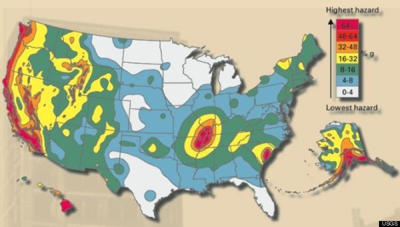
This map was created by the USGS and illustrates the risk of earthquakes across the United States. The data is based on fault lines and shows the highest risk being on the West Coast and Southern Alaska. Interestingly enough, the central US has a high risk for earthquakes as well. One can see that Southern California has an extremely high risk for earthquakes, due to the large number of faults running through this region.
Website: http://www.huffingtonpost.com/2010/01/22/us-fault-lines-graphic-ea_n_432948.html
Subscribe to:
Posts (Atom)